View Organization
This default checkbox editor view is separated into three columns of activity:
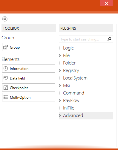
 The toolbox at the left contains items that may be added to the checklist structure: groups, elements, and plug-ins.
The toolbox allows adding new objects to the current checklist item flow. By simply dragging a group or element to the area with the already defined elements and dropping it at the desired target position, users add a default object that is ready for adjustments. Please refer to the element related sections to get more information about the options available for adding, moving and manipulating checklist items. An additional section is available with group option details.
![]()
![]() Use the arrow icons at the upper left corner of the toolbox to undock or dock the whole column. The undocked toolbox allows users that operate on monitors with small resolutions to organize their Checklist Editor interface according to their individual space requirements. Adjusting the height and the width of the undocked toolbox is possible by using the standard application window resizing functionalities provided by the underlying operating system.
Use the arrow icons at the upper left corner of the toolbox to undock or dock the whole column. The undocked toolbox allows users that operate on monitors with small resolutions to organize their Checklist Editor interface according to their individual space requirements. Adjusting the height and the width of the undocked toolbox is possible by using the standard application window resizing functionalities provided by the underlying operating system.
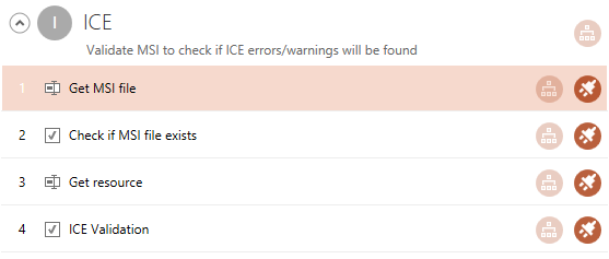
The checklist structure is displayed within the center column of this view. It shows all groups and elements of a checklist along with their hierarchy structure.
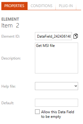
Selecting an object within the center column loads it's data into the details pane at the right-hand side of this editor view. From this pane, users have access to modify group & element properties (such as description, options, etc.), conditions and plug-in usage.
Checklist Organization
A checklist consists of any number of groups, which can in turn contain any number of elements. Whist groups are aligned in a flat sequence of single objects, elements may be adjusted in multi-level tree structures. From an organizational point of view, groups are task bundles, whilst their elements are single task steps users have to perform whilst evaluating the checklist.
Both, groups and elements, may be equipped with conditions, so that they are executed according to the results of prior element tests. Checklists are assumed to be worked in a top-down step by step manner. Therefore, the evaluation of conditions for dynamic content availability always expects prior checklist items to be already evaluated.
The result of all currently visible checklist items is summed up to the general checklist result, which is displayed as a color coded ribbon at the lower right corner of the Checklist Viewer interface. An element result may consist of a boolean Yes or No information, a comment string, or the selection of a single value from an option set. According to the integration of automated plug-ins, item results may be entered manually by the evaluating user, or automatically as a result of a plug-in logic execution.
The default checklist is already equipped with a group, which itself has been filled with a Data Field checklist element. Starting from this minimal setup, users are free to add as many groups and elements as required to fulfill the checklist purpose.
|
Be aware: In order to keep checklist templates as clear as possible, it is not allowed to add elements to a checklist directly. They always have to be defined within a group container. |
Groups
Group objects are structural elements, designed to support organizational needs and logical restrictions for checklists.
Within the toolbar, group items are represented by a group item. Users have to apply drag and drop on it in order to create new groups within checklists.
Within the checklist structure column, each group is displayed with a headline that contains its roman index number value (I, II, III, IV, etc.) and the group title. Elements that belong to the group are displayed slightly indented, as an element hierarchy tree below the group headline. Once the user clicks on the headline, the background-color switches to orange and the group properties are loaded into the tabbed area of the details pane on the right-hand side of the Editor interface.

The headline of a group within the Checklist Editor: Roman index value, title and description

The headline of an unselected group when the mouse pointer hovers above it.

The headline of a selected group with colorized background
Please refer to the Groups section for further details regarding the options available within group objects, such as conditions, element positioning and nesting, and the like.
Checklist Elements
The checklist elements are single test steps. They have to be bundled within groups in order to provide a decent checklist task organization. Therefore, elements always reside within group containers. They are represented by single boxes with a light orange background color once they are selected by a left-click. Depending on the element type, different options may be set by the integrated control buttons.
Each element has a number, displayed in the upper left corner of the element resemblance within the checklist structure. The number is unique and incrementing within each parent group. If elements are nested, each level has got its own numbering resemblance (e. g., 1, 1.1, 1.2, 1.2.1, 1.2.2, etc.).
An element within the structure of the Checklist Editor: Index value, description, type icon, plugin and condition indicator icons
The unselected element item when the mouse pointer hovers over it.
The selected element item with colorized background.


