The Library catalogs the packages imported by users for testing. This library can be accessed by selecting software element on the RayQC Advanced Dashboard. This library is basically a front-end for packages which are imported by users and stored in the back-end SQL database.
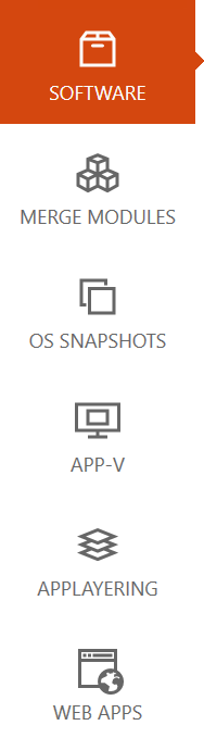
The library categorize packages into five types: SOFTWARE, MERGE MODULES, OS SNAPSHOTS, APP-V, and WEB APPS. Within each of the categories a user can arrange packages using hierarchical folder structures.
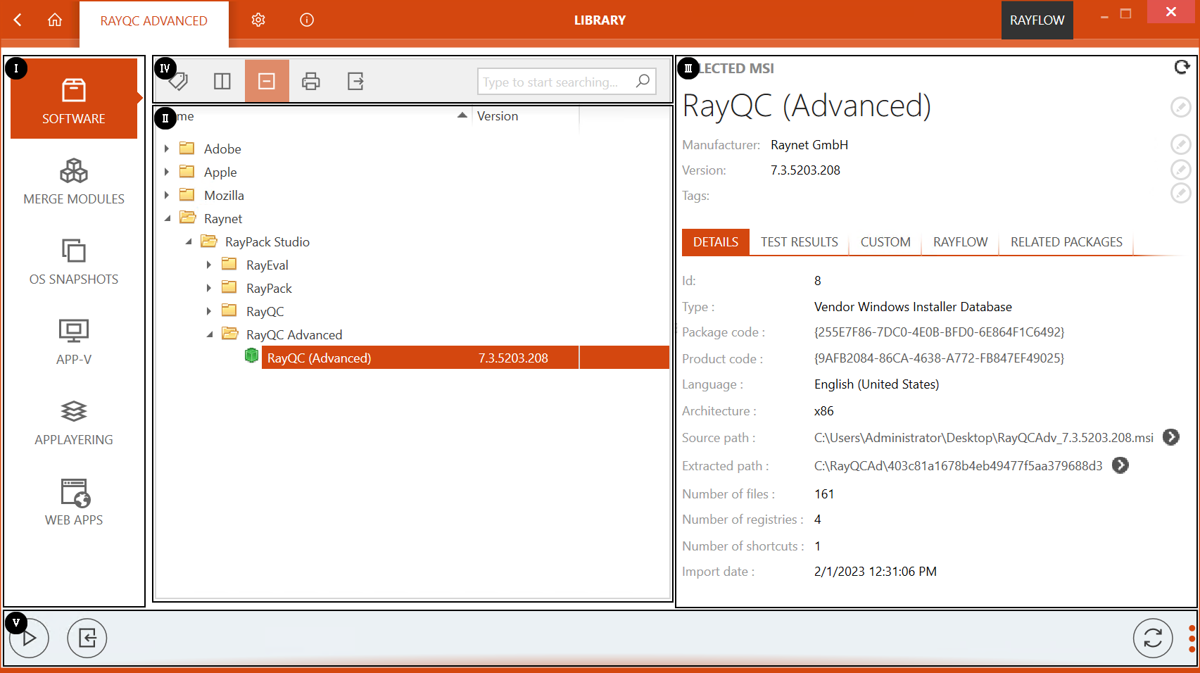
The Library interface can be divided into five areas:
1. Imported file type
2. Content area
3. Side bar
4. Functional Tool Bar
5. Swipe bar
Imported File Type
As previously mentioned, the Library categorizes packages based on their type. These types include software(.msi), merge module(.msm), OS snapshot(.rcs), APP-V (.appv) and web applications. To import a package in the content area, a user first need to select the package type from this area.
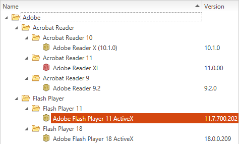
Content Area
Content area of the Library is the area where packages are stored and cataloged. For an imported package, the name and version of the package is shown under the Name and Version column headers.
 |
 |
 |
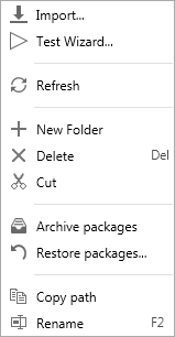
context menu: folder |
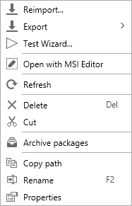
context menu: package |
context menu: web application |
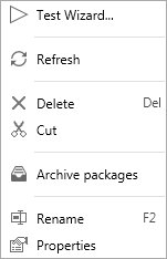
Functional options available in this area can be accessed by the context menu. This menu is available when a user right clicks within this area. Options available through context menu include:
•Import...: When selected, the import package wizard is launched. It is important to note that, a package can only be imported inside a folder. Hence this option only gets activated when a user right clicks on a folder.
•Reimport...: Allows a user to reimport a package into the Library
•Export
This option can be used to start the Deployment Wizard and export the selected package.
•Test Wizard...
When chosen on a package, this option launches the test wizard with the selected package as source package for testing.
•Link RayFlow package
Allows a user to link the selected package with a RayFlow package.
•Unlink RayFlow package
Allows a user to unlink the selected package with a RayFlow package.
•Open with MSI Editor
This option is only available if an MSI editor is installed. The source package that has been imported can be edited in the configured MSI editor. By default, RayPack is the configured MSI editor.
•Refresh
Refresh the content area
•New Folder
Creates a new folder
•Delete
Allows a user to delete a folder or package from the content area. Can also be used by using the Del shortcut.
•Cut
This allows the user to move an item or a folder to another folder. Clicking on Cut after the context menu has been opened on an item or a folder will enable the Paste option. If the Paste option is used on a target folder, the item or folder on which the Cut option was used will be moved to the selected folder. Be aware, that a folder cannot be moved to its sub-folder but only to a different folder. Items and folders can also be moved by drag and drop.
•Archive
This function is used to archive packages together with the corresponding reports in the database. Archived packages are not shown in the library and cannot be used as target packages.
•Restore...
This function opens a window which shows all packages which are archived in the database. The archived packages can be restored to the library. The Restore... function is only visible if the context menu is opened on a folder.
•Copy path
Copies the path under which the target package is stored in the database into the cache.
•Rename
Allows a user to rename an imported package or folder. This function is also accessible via F2 shortcut.
•Properties
When selected on a package within the Library, a properties wizard is available. This wizard shows details pertaining to a package. For more on properties refer to this section.
Content Management
Within the content area of the Library, users can define folder structure to arrange packages in a hierarchical fashion.
Side Bar
Side bar is available on the right side of the Library. When a package is selected in the content area, properties and test result pertaining to it, is shown in this area.
DETAILS
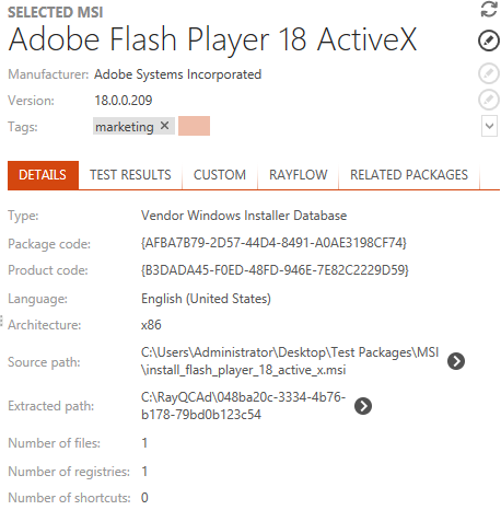
As shown in the image above, the swipe bar on top shows the basic properties of the package including its name, manufacturer, version, and tags. A user can modify these properties by selecting the edit tool, which is available on the right side of each property.
Further information on the selected package is divided under the tabs: details and test results. Under the details tab following properties are shown for the selected package:
•Type
The type of the imported MSI (Vendor / Self-made / Wrapper).
•Package code
The unique identifier of the package.
•Product code
The unique identifier of the product.
•Language
The application language is shown as string and the related language code is shown as tooltip.
•Source path
The path from which .msi file was uploaded.
•Extracted path
The extract path where the file from Windows Installer has been extracted.
•Number of files
The number of files from the package.
•Number of registries
The number of registry entries.
•Number of shortcuts
The number of shortcuts in the package.
TEST RESULTS
Current and historical test results for a selected package are available under the TEST RESULTS tab. Information available under this tab is interpreted using raw data, symbols, and a graphical chart.
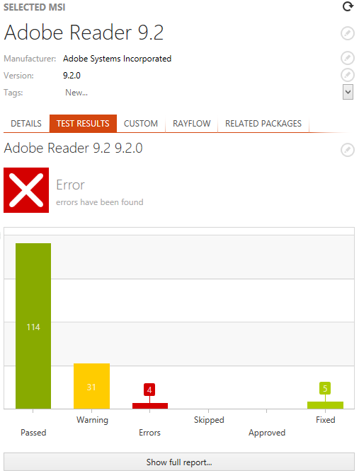
Just under the TEST RESULTS tab, the name of the package is shown. Clicking on the edit tool, next to this name will show the historical test result for the package.
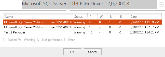
A user can access the full test report for the selected package by clicking on the Show full report... button, which is available at the bottom of this tab.
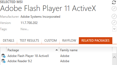
RELATED PACKAGES
Packages belonging to the package family of currently selected package are shown under the RELATED PACKAGES tab of the side bar. For more information on Package Families see the Package Families and Tags section of this document.
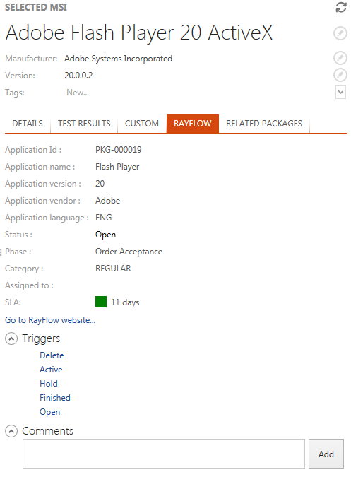
RAYFLOW
Details about linked RayFlow packages are available in the RAYFLOW tab. A user can find package information as well as change the current trigger or add a new comment.
Functional Toolbar
A Functional Toolbar is located above the content area of the Library view. Each of the functionality offered through is toolbar are described in turn in the following sections.

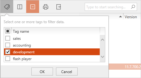
Filtering Data Based on Tags
Tags can also be used to filter data within the library. For more information on Tags see the Package Families and Tags section of this document.

Click on the tags icon to show a list of existing tags. Select the target tags for filtering and then click on the OK button.
Column Chooser
A user can change the position of each column by dragging it to the desired position. During dragging blue arrows indicate the target position when the column is dropped at this point

Click on the Column Chooser icon to display the Column Chooser menu. It contains all the available columns, that are not displayed in the current list setting. To add a column to the view, simply drag it from the menu to the header section of the Library. To remove a column, drag the column header to the Column Chooser menu.
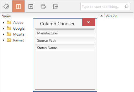
To close the Column Chooser menu, click on the close icon at the upper right corner of the menu, or use the choose columns icon.
Collapse All Groups

The Collapse all groups button is automatically shown and highlighted when one or more groups have been expanded either manually or by using the Expand all groups button. If clicking on the Collapse all groups button, all groups in the Library will be collapsed and the button will be replaced by the Expand all groups button.
Expand All Groups

The Expand all groups button is automatically shown when all groups have been collapsed. As soon as one group is expanded the button is replaced by the Collapse all groups button. If clicking on the Expand all groups button, all groups in Library will be expanded and the button will be replaced by the Collapse all groups button.

To print the currently displayed content of the Library view, hit the print icon. A dialog opens, that allows a user to select the desired printer and printing options.
Export

Exporting the library contents can be handy for communication on certain items or structures.
The currently displayed contents of the Library view can be exported to the following formats:
•Excel
•HTML
•CSV
To export data:
1.Click on the export icon.
A dialog opens, in which a user can select the desired format and target location for the export.
2.Click OK to start the export.
Search
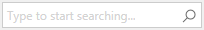
A user can search through the Library by using the search bar. Based upon the entered search keyword, the catalog will be filtered to show the related content.
Swipe Bar
Swipe bar is available at the bottom of Software view. The swipe bar comes along in two display states: expanded and collapsed. In the collapsed state, there are only button icons while the expanded mode displays additional text information about functionality related to each button provided within the swipe bar. To switch between two, described states, user have to click on the dot icons at the right-hand side of the swipe bar.
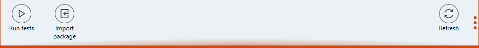
Following functions are available through this bar:
•Run tests: Launches the test wizard
•Import package: When selected, the package import wizard is initialized
•Refresh: Refresh the content area
Properties of Packages
When opening the context menu on a package and selecting Properties from the context menu there are two tabs available. The BASIC INFORMATION tab, which offers editable information about the selected package, and the PACKAGE FAMILY tab, where the Package Families of a package can be edited. The changes made by the user can be applied by using the Apply button at the bottom right corner of the PROPERTIES window. For more on the PACKAGE FAMILY tab and the function of Package Families refer to the Package Families and Tags section of this document.
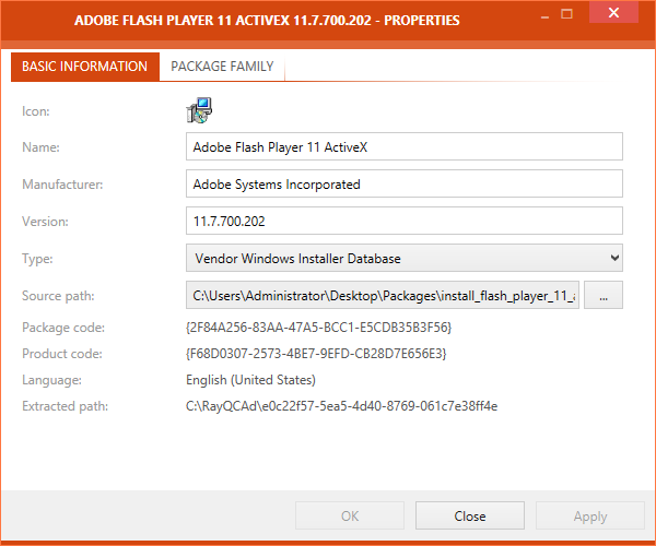
In the BASIC INFORMATION tab the following information are available:
•Name
This field contains the name of the package. This field can be edited.
•Manufacturer
This field contains the name of the manufacturer of the package. It can be edited.
•Version
This field contains the version number of the package and can be edited.
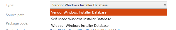
•Type
The type of the package can be set to either Vendor Windows Installer Database, Self-Made Windows Installer Database or Wrapper Windows Installer Database. The respective type can be chosen by using the drop-down menu.
•Source path
The path to the source package an be set here. By default, this is the path from where the package has been imported into RayQC Advanced Advance. This field is editable.
•Package code
The package code is shown here. The package code cannot be edited by the user.
•Product code
The product code is shown here. The product code cannot be edited by the user.
•Language
The language of the package is shown here. This information cannot be edited by the user.
•Extracted path:
The extraction path of the package is given here. It consists of the normal extraction path and the specific folder to where the package has been extracted.
Properties of Web Applications
When opening the context menu on a web application and selecting Properties from the context menu the Properties screen for the web application is shown.
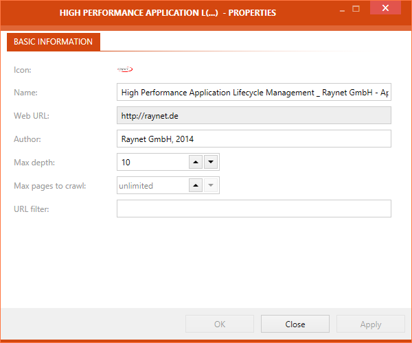
In the BASIC INFORMATION tab of the PROPERTIES window the following information are available. Most of the fields are editable and changes can be saved by using the Apply button:
•Icon
This field contains the icon of the web application. This is one of two fields in the PROPERTIES window of the web application that is not editable by the user.
•Name
This field contains the name of the web application and is editable by the user.
•Web URL
This field contains the URL of web application. This is is one of two fields in the PROPERTIES window of the web application that is not editable by the user.
•Author
This field contains the name of the author of the web application and is editable.
•Max depth
This field contains the Max depth that will be used when scanning the web application. This option defines the maximum number of links the web crawler will follow (e.g. the target application contains a link to another web application which links to the next web application etc.). This field is editable by the user.
•Max pages to crawl
This field contains the maximum number of pages to be crawled by a scan of the web application. This option defines the maximum number of pages that will be scanned. This field is editable by the user.
•URL filter:
The URL filter can be set here. A scan will only include pages matching the filter and exclude all other pages. For example, if *.raynet.* is set as filter, the web crawler will only scan pages where the URL contains ".raynet.". This field is editable by the user.