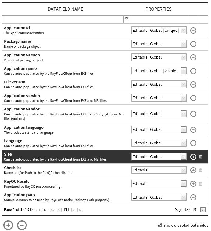
The Datafields page in RayFlow web interface allows a user to define datafields and custom fields to be used within the project. This section of the document describes how a user can create and manage normal datafields for a project. Information of custom fields is available in the Custom Fields section of this document.
A datafield defines a user input field which can either be used within each phase or in one or more phases. Currently RayFlow supports datafields of the types text box, drop-down list, and multi-drop-down list.
The user interface for this feature is divided into two areas: Datafield list and Configuration. The Datafield list shows already existing datafields and its properties. Configuration related to a datafield that is selected from the datafield list is shown under the Configuration area.
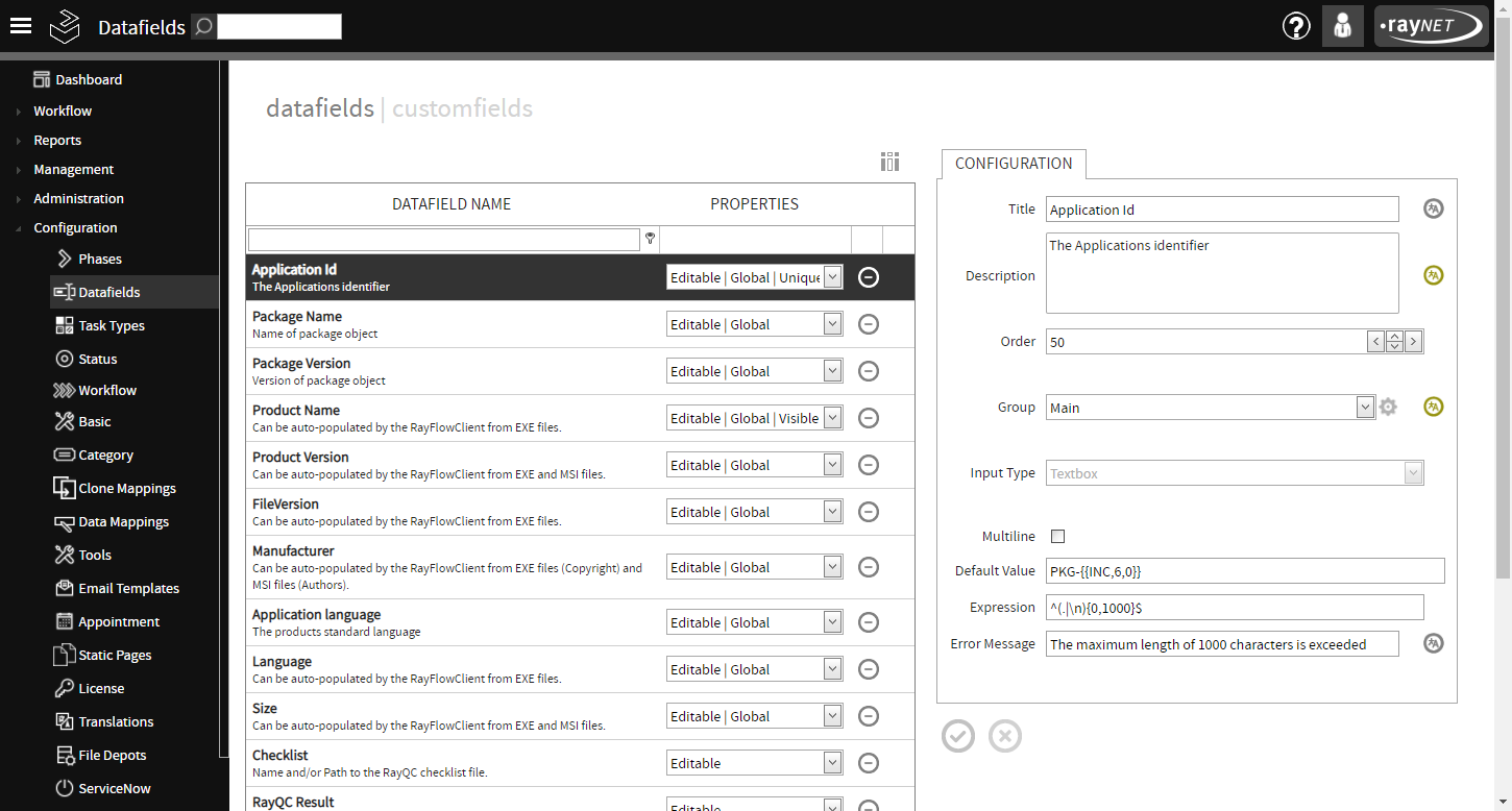
Creating a Datafield
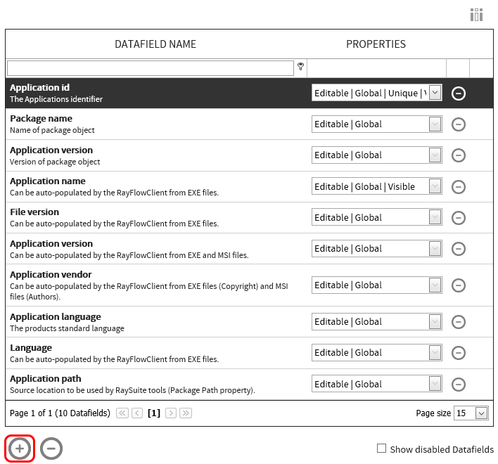
To create a new data field click on the Create new Datafield icon. This icon is available at the bottom of the data fields this.
The Create New Datafield dialog is shown. Configuration properties for the datafield are provided via this dialog. After specifying the datafield properties, click on the Create button to finalize adding the datafield to the datafield list.
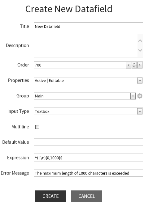
•Title: Name of the datafield.
•Description: Brief description of the datafield.
•Order: Order number of the datafield. This order number defines the order in which the datafield would appear in relation to other datafields.
•Properties: Properties of the datafield can be selected from the drop down list. The following properties are available:
oActive: Defines if a field is enabled or not. This option is only available in the Create New Datafield dialog.
oAutocomplete: Remembers previously entered values.
oPath selection: The datafield will offer a Browse button (the Browse button is only available in RayFlow Client).
oEditable: In all phases the datafield is editable by default.
oEmail: The datafield is listed by the $DATA_FIELD$ e-mail placeholder.
oGlobal: The datafield is available in all phases.
oUnique: Enforces that the field value cannot be same as an already existing value.
oVisible: When a datafield is visible it will be available as acolumn in the default phase tables. Be aware, that the visible datafield property differs from the phase visiblity of local datafields.
|
Note: The tracking task name is created by the datafields with the visible property. If no data mapping has been set, the name in the tracking comes from the data mapping and additionally from the custom fields. |
•Group: Allows the association of the datafield to a field group. This configuration item only allows an existing group to be selected. For information on how to create new group, please refer to the Group section of this chapter.
•Input Type: Defines the type of the datafield. RayFlow allows a user to create data field of types: Text, Drop-down menu, Drop-down menu multi and checkbox.
Following configuration items are only shown for a datafield of the type text box:
•Multiline: Allows multiple line input to the datafield when checked.
•Default Value: A default value for the datafield can be defined. The given value can also use regular expression.
•Expression: Regular expression to control the input value to the datafield can be defined.
•Error Message: An error message that will be shown if the input to the datafield is not in accordance with the regular expression.
The following option is shown for the datafield of the types drop down menu and multi drop down menu.
•Dropdown Menu Content: This option is provided for uses to define options for the drop down list.
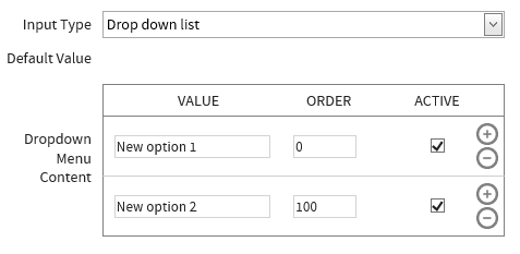
New options can be added by clicking on the Add new datafield option icon. And an existing option can be removed by clicking on the Delete this datafield option icon. An option for which the Active checkbox is not checked, that option will not be shown in the drop-down list.
Group
This allows for grouping of datafields within a phase. At least one datafield needs to be associated with it, in order for the group to be displayed within the phase. Main is the default group to which all the datafields are added. Please note, that in case a project has got multiple field groups, then only one of them can be a default group and this group will always be shown first within the phases.
To add a datafield to a new group:
1. Select the datafield from the Datafields list. The related configuration is shown under the configuration area
2. In the configuration area, locate the group configuration property. Next to this property is a cog-wheel icon. This icon will show the Group Configuration item when selected.

3. Click on the Create New Datafield group icon to add a new group. This will show the group creation dialog.
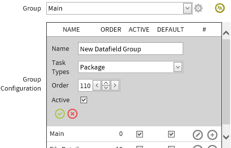
4. Specify following properties of the group:
•Name: Name of the Group
•Task Types: Task Types can be added to the selected group by using the dropdown menu.
•Order: Order number of the group. The order number controls the order in which this group will be shown in relation to other groups. The default group will always be shown first
•Active: A datafield can only be added to an active group
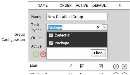
5. Click on the Save icon to finalize creating the new group
Disable a Datafield
A datafield cannot be deleted from the database. However, a datafield can be disabled within a project. A datafield can be disabled by using the Disable Datafields icon.
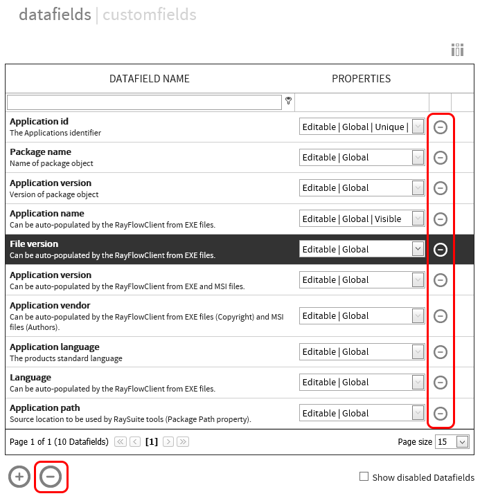
After selecting a datafield from the datafield list, when a user clicks upon the Disable Datafields icon, a confirmation notification is shown.
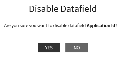
Click on the YES button to disable the datafield.
A disabled datafield is not shown in the datafields list. They can be shown in the list by activating the Show disabled Datafields checkbox. Disabled datafields are shown in the list with a gray trashcan icon.
