This chapter of the document describes how an existing checklist can be loaded into the RayQC Checklist Viewer and can further be edited using the Checklist Editor.
To Open a Checklist for Execution
Follow the steps to open a checklist in RayQC:
1.A user can open a checklist by either using the open checklist tile from the dashboard or by selecting the OPEN -> Open Checklist item in the File Menu.
|
Note: By using the open checklist tile on the dashboard, a user can only open checklist templates (*.rqct), whereas using the OPEN button from the menu bar allows either the opening of a checklist template or project (*.rqcp). |
When either of these options is selected, RayQC opens an explorer dialog titled Open a checklist.
2.Navigate to the location where the desired checklist is located.
3.Select the checklist file (*.rqct), and click on the Open button in the dialog.
The checklist is now loaded into the RayQC Checklist Viewer, where it can be executed. In order to edit the underlying checklist structure, users have to switch to the Checklist Editor. This can be achieved by either clicking the Edit this checklist button from the swipe bar available at the bottom of the screen, or using the shortcut Shift + Tab.
The Checklist viewer is the user interface view that is active when a checklist is opened for review / execution within RayQC. Therefore, to display the Checklist Viewer:
•Use the open checklist tile from the Dashboard on the Home screen
•Click on one of the template items from the Recent list on the Home screen
•Use the Open view from the FILE menu and select the template file type
•Hit Control + O to browse the Windows system for a project file
|
Be aware: Whenever a file is opened in RayQC, it is checked for structural validity. Files that contain poorly formed source structures are rejected, and cannot be displayed within the Checklist Viewer or Editor. When users try to open files that have originally been saved in one of the deprecated RayQC file formats, they will be rejected if they do not match the current template or project file format restrictions. |
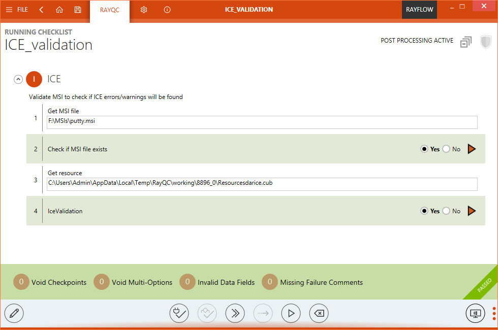
Either way, the selected file (checklist or project) is opened within the Checklist Viewer. The screenshot below shows this user interface state with one of the RayQC sample checklists opened:

Checklist Viewer Overview
The application window is separated into different areas with specialized functionality and data as requested for the optimal user interaction support.
Main Toolbar
The menu bar has been extended with the actual checklist name of the currently viewed project on the left-hand side.
|
Be aware: Any checklist opened in the Checklist Viewer is automatically transformed into a RayQC project, residing within the temporary system memory until it is saved permanently on any system location. Leaving the Checklist Viewer without saving the changes made to the actual checklist run / evaluation results does not take any effect on the underlying checklist. Saving the changes of the current checklist evaluation / run creates a RayQC project file type by default. To manipulate the checklist structure underneath the RayQC project, it must be executed within the Checklist Editor view. Please refer to the Checklist Editor section within the RayQC User Guide to get more details on how to manipulate checklist structures. |
Content Area
Checklist Area
The actual content area begins with the listing of the checklist items in their group containers. According to the order and nesting designed within the Checklist Editor, all items that do not depend on conditional options are displayed with their type specific input controls. Users may directly enter the results of their checklist execution, call help files for further information on the checklist in general, or a specific checklist element. plug-ins can be executed and comments may be entered. All in all, the checklist area is the place where the actual end-user evaluation works with RayQC.
Checklist elements are equipped with an index value, which is unique within all items of the same parent group container. The index does not only give information about the position of the element within the item sequence of the box, but also about the indentation level of the item. The index is a multi-level indicator value, with a colon separating the different tree levels. For example, an item with the index value 2.3 is the third child of the second checklist item within a group.
The elements within a group are displayed with alternating background colors in order to support easy visual element distinction. Once Checkpoint elements have been evaluated, an additional background color markup is applied to them. If it fails, the background will turn slightly orange; if it passes, the background will turn slightly green.
Please refer to the Checklist Structures section of RayQC User Guide for details regarding the different options that may be applied towards checklist design and functionality.
Task Bar
The task bar below the checklist elements displays a set of status indicators, which support users in their goal to completely evaluate the checklist elements with the least possible effort.
At the left-hand side, there are four color coded status boxes, indicating the completeness of each checklist element group:
•Missing Entry Selections
•Missing Multi-Option Selections
•Missing User Comments
•Missing Failure Comments
Taskbar Status Indicator
A number greater than zero in one of these items indicates that the checklist evaluation task is not complete yet, since there is at least one more user input or activity required (See the right number presented within the illustration above). Whenever a task group is incomplete, the button is opaque, and when a task group is complete they are shown partially transparent (See the left box presented within the illustration above). The appearance is designed as a quick hint for missing information, while the number indicates the amount of open tasks that need completion before the checklist evaluation / run is complete.
Clicking on one of the task buttons with a non-zero number focuses the first incomplete checklist element according to the task group title. For example, the button for missing data fields is opaque and displays a 3 on the left side. Therefore, there are 3 checklist elements that have not been entered yet. Clicking on the button scrolls the checklist area to a scope that displays the first empty data field. As soon as the user enters a value for that element, the number of missing items displayed in the task bar button is decreased by one. Clicking the button again loads the next data field checklist element that needs user interaction into the visible scope of the checklist area.
Since checklists may become comprehensive and complex for in-depth quality assurance procedures, the task bar indicators are helpers for those situations where checklists may not be fully evaluated within one working session. They also help to keep track on conditionally displayed checklist elements. Therefore, it is recommended to use the task bar buttons after the initial run through the entire checklist and complete the tasks with their guidance.
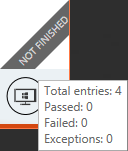
Another visual indicator within the task bar is the result ribbon at the right-hand side. When a checklist is opened for execution as a project for the first time, the default ribbon state is a gray background and the label NOT FINISHED.

Checklist Viewer Result Ribbon
Hovering over the ribbon reveals a summary of checklist properties, such as the number of successful and failed checks, as well as, the total number of currently available checklist elements. This total is updated according to the actual state of element availability as derived from conditional statement examination.

Checklist Viewer Result Ribbon with Tooltip
Once all checklist elements are evaluated, the result of the checklist run is available: The checklist test has either passed (indicated by a green background color and the label PASSED for the ribbon), or failed (indicated by an orange background color and the label FAILED for the ribbon).
Well, actually there are some additional circumstances and conditions that decide whether a checklist has been passed or failed, but please read about them within the Checklist Structures chapter of RayQC User Guide. For now it is just required to know that the ribbon at the right-hand side of the task bar actually indicates the result of a checklist project evaluation.
Swipe Bar
The command bar contains controls to use in combination with the currently opened resource file:

Swipe Bar
Edit This Checklist
Clicking on this button opens the Checklist Editor with the template of the currently visible checklist already loaded for manipulation. As a handy alternative, use the swift Shift + Tab shortcut to switch between the Viewer and Editor mode.
Validate Plug-ins Data
If the currently opened project contains plug-in calls, hitting this button checks whether they are logically correct or not. Possible reasons for conflicts are:
•Incorrect input parameter values or formats
•Invalid relations between elements and plug-ins (order of usage)
The result of the plug-in check is a message dialog, stating that all plug-in integrations are flawless or that issues have occurred. If there are issues, the message dialog may be expanded to display details on the conflicts found within the plug-in definitions. In this case, it is recommended to change the mentioned plug-in parameters and recheck the checklist until all issues have been cleared.
Validate Conditions
If the currently opened project contains conditions, hitting this button checks whether they are logically correct or not. Possible reasons for conflicts are:
•A defined condition combination will never occur, because two or more condition terms demand different results from the very same checklist item.
•Condition literals within the same clause (bucket) and clauses within the same term are defined as duplicates, e. g. one term demands result A from checklist item no 1, and the next term of the same conditional construction also demands result A from checklist item no 1.
The result of the condition check is a message dialog, stating that all conditions are flawless or that issues have occurred. If there are issues, the message dialog may be expanded to display details on the conflicts found within the conditional statements. In this case, it is recommended to change the mentioned condition terms and recheck the whole condition set of the checklist until all issues have been cleared.
Run Post Process Actions
This button can be enabled for a checklist via the Enable post process actions checkbox. This checkbox is available under the Post Processing tab of the checklist editor. Based on the conditions defined under this tab, a set of predefined actions will be executed either by clicking upon this button or automatically when a user selects the Run All button. Furthermore, post process action of automatically creating and uploading a report to RayFlow can also be initiated via the command line switch.
Bypass
The bypass option is available if the checklist is configured to allow manual result bypassing. For those projects that base on checklists with bypass permission, the bypass button becomes available once the checklist elements have been fully evaluated and a result (PASSED or FAILED) is displayed in the ribbon at the right-hand side of the task bar.
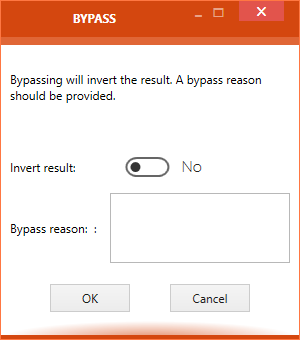
Hitting the Bypass button displays the BYPASS dialog. Within this dialog, the user should write a note why the bypass was required. Setting the result bypass state to Bypass (by clicking on the radio control item option Bypass) reverts to the original checklist project result (e. g. from original result FAILED to the new, bypassed result PASSED).
Clicking the OK button within the BYPASS dialog saves the new result settings and closes the BYPASS dialog.

ByPass Control
It is possible to revert the bypass, which restores the original checklist evaluation result state again. To do so, users call the BYPASS dialog and move the Invert result toggle slide to YES.
However, conditions regarding required circumstances for bypassing and bypass revocation have to be defined by the creator of the original checklist template used within the current project instance.
Run All
If a project contains checklist items with plug-in usage, hitting the Run All button automatically executes all plug-ins at once. All plug-ins are run in turn, beginning from the one that has the highest position within the checklist tree. The execution is kept procedural, which means that plug-in B will start when plug-in A has finished. plug-in A and B will not be executed in paralle. Therefore, plug-ins that require input based on earlier plug-in execution results will always rely on current results when the Run All function is used.
If the Run All button is used after one or more plug-ins have been run (manually or automatically), RayQC displays a dialog asking the user if former results should be overridden by the new execution or if the Run All execution should be aborted instead.
|
Be aware: On Run All, element's visibility will be evaluated after each plug-in execution and the checklist will be processed correctly. Only elements that requires a manual input will not be processed, and their condition will not be fulfilled by any plug-in. |
Reset
Using the Reset button clears all checklist element results that are part of the respective checklist in the Checklist Viewer. If a checklist has been opened in a project scope including a former evaluation state, resetting does not reset to that state, but to the default initial state as given from the checklist element definitions.
|
Be aware: Reset does not reset the original checklist element settings of a checklist under construction. It simply removes the result information entered within the Checklist Viewer mode. Adjustments made towards the checklist elements within the Checklist Editor are kept unchanged. |
Show / Hide Swipe Bar Labels
The swipe bar comes in two display modes: expanded and minimal. The expanded mode displays a label for each button of the task bar, whereas the minimal mode contains only icons users may click on. Hitting the button with the three vertical dots at the right-hand side of the task bar switches between the expanded and minimal task bar display modes.