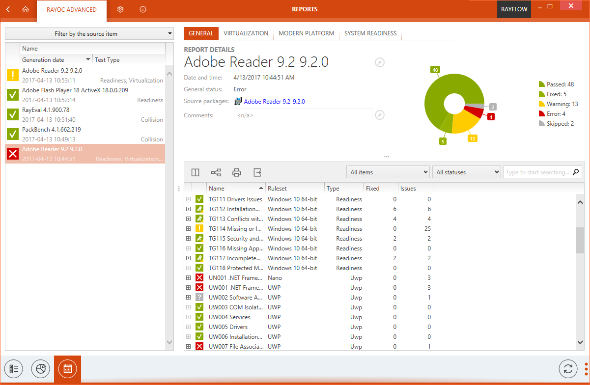
Reports section of the RayQC Advanced provides an intuitive platform for users to view and export historical test results pertaining to the packages. Along with having a consistent design, this section presents information in an informative format using various symbols, color coding and pie charts.
Structure of Reports viewer: The reports viewer area can be divided into three major sub-areas
1.Package List
2.Report Details
3.Swipe-bar
Package List
Package List is shown on the left side of the Reports viewer. It lists all the packages on which tests have been executed. The package list shows the properties of a package including package name, test date and test result under the respective column headers. These column headers can be arranged in a desired order by simply dragging and dropping it to its new position.
Symbols in Package List
Each of the packages within the package list is coupled with a status symbol. This symbol represents the overall result of test, executed on a package.
 |
Represents that a package has passed against all the rules with the test |
 |
Represents that a package test result contains warning for certain rules |
 |
Represents that a package has failed against certain rule with the test |
|
Represents that a test has been skipped |
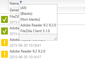
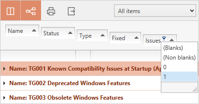
Filtering of Packages
A user can filter the package list using the column filter icon ( ) which is available next to each of the column headers. This icon, which is initially invisible, is shown once the mouse pointer is hovered over a respective column header. Clicking on this icon will list the filtering options, which are based upon the respective package property; to which the column header is associated with. All, Blanks and Non Blanks are the default filtering options for each of the column based filtering.
•All: This will list all the packages.
•Blanks: This will list the packages for which the respective column header property is blank.
•Non Blanks: This will list all the packages for which the respective column header property is non-blank.
Filter Editor
When a user activates the column header filter, by default the filter editor is activated. This filter editor bar is shown at the bottom of package list. A user can edit the filter condition by directly selecting the edit icon on the filter bar. To remove filtering simply click upon the Cancel icon on the filter bar.
Filtering by Source Package
RayQC Advanced offers a user an ability to test a package against another package. Packages within the package list can also be filter based on their source test package. To achieve this, select Filter by source package option. This will open a dialog with all the packages within library. Simply select a source package and click on the Apply button to apply this filter on the package list.
Sorting of Packages
Packages within the package list can be sorted by using the sorting icon. This icon is available in each of the column headers. When clicked upon, the package list will be sorted in an ascending or descending order for respective type of the package property (alphabetic or numeric).
Report Details
When a package is selected from the package list, details pertaining to the test of that package are shown under the Report Details section. This section is subdivided into three areas:
a.Test Type
b.Package properties
c.Result Details
Test Type
This area of Report Details consists of tabs. Each of the tabs represents a test type. When a tab is selected, all the test results pertaining to that test type is shown under the Result Details section. The General tab is available by default and when selected, test result from all the test types is shown under the Report Details section.
Package Properties
Just below the test type tabs, properties of a tested package are shown. These properties include: name and version of the package, date and time of testing, source package and comments. It is possible to edit the name and version of tested package or to add a new comment. To do so, simply click on the edit icon and make or add changes as desired. To apply the changes, simply click on the OK button and the same can be rejected by clicking on the Cancel button.
The package properties are paired up with a pie chart. The test results for the package is plotted against the number of rules, the package is tested against. Following color convention is used for plotting of this chart:
|
Passed |
|
Fixed |
|
Warning |
Error |
|
Skipped |
Result Details
In this section of Reports view, the test results pertaining to a package is shown. The test results basically include a list of rules against which the package has been tested. If a package has been tested against rules belonging to different test types, then a user can filter these rules using test type tabs on top of the package properties section.
Each of the test rules is paired with an icon, which visually delivers the result of test.
 |
Represent that no issues have been found in the package for that particular rule |
 |
Represents that the test result consists of a warning |
 |
Represents that the test result consist of a warning but has been fixed |
 |
Represents that the test result consists of an error |
 |
Represents that the test result consists of an error but has been fixed |
 |
Represents that the test has been skipped |
Above the result details section, a functional bar offers following ability to users:
•Column Chooser
•Advanced Sorting
•Export
•Filter by package
•Filter by status
•Search
•Column Filtering
Column Chooser
The position of each column can be changed by dragging it to the desired place. During dragging blue arrows indicate the target position when the column is dropped at this point.

Click on the Column Chooser icon to display the column menu. It contains all available columns that are not displayed in the current list setting. To add a column to the view, simply drag it from the menu to the header section of the report details section. To remove a column, drag the column header to the column menu.
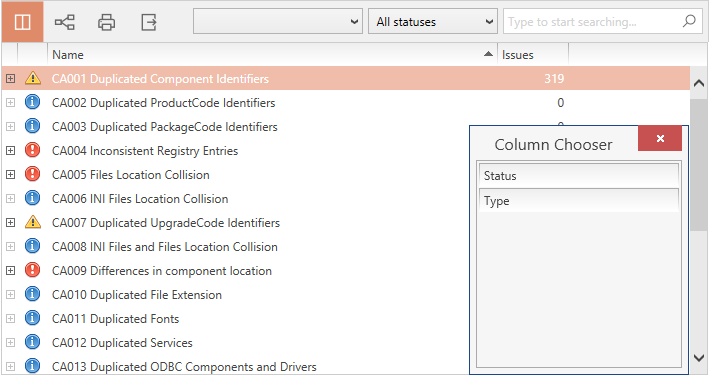
To close the Column Chooser menu, click on the close icon at the upper right corner of the menu, or use the Choose Columns icon.
Advanced Sorting
To enable the Advanced Sorting editor, click on the Advanced Sorting icon from the action bar. The advanced sorting bar is displayed. To add a criterion to the advanced sorting, drag a column header to the advanced sorting bar area and drop it there. Two blue arrows mark the exact position where the header will be dropped.

The position of the criteria within the advanced sorting bar indicates the way the list is sorted. The illustration below shows a sort algorithm that sorts by Name, with this it sorts by Status and within this it sorts by Type.
To change the sorting hierarchy drag a criteria from one position and drop it at the desired position.
After dropping the criteria into the advanced sorting bar, the sort icon in the right part of the criteria indicates the sorting order for each of the criteria. The order can be changed from ascending to descending and the other way round by clicking on the symbol. Furthermore, by clicking between the sort icon and the name of the criteria, filters can be activated. These filters can be chosen from a drop-down menu.
If the Advanced Sorting icon is displayed with a dark gray background, the advanced sorting editor is visible. Clicking the icon will close the editor. Advanced sorting will not be deactivated by this. To deactivate advanced sorting, drag all column headers back into the column header section of the list view. The Advanced Sorting function is inactive when the sorting editor bar is empty.
To print the currently displayed content of the result details view, hit the print icon. A dialogue opens, that allows you to select the desired printer and printing options.

Export

Exporting the result details view contents can be handy for communication on certain items or structures.
The currently displayed contents of the result details view can be exported to the following formats:
•Excel
•HTML
•CSV
To export data:
1.Click on the export icon.
A dialogue opens, in which you can select the desired format and target location for the export.
2.Click OK to start the export.
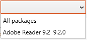
Filter by Package
If a test has been executed on a set of package, then the test result can be filtered per package. To achieve this, use the drop-down list in action bar to select a package for which the test results should be shown.
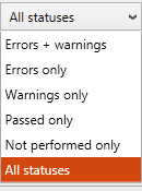
Filter by status
Test results can be filtered based upon the status (result) of test rules. To achieve this, select the desired status from the drop-down list; this will automatically filter the test result based upon the status.
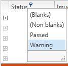
Column Filtering
It is possible to either use the column value filter to reduce the displayed test results to a certain subset or to use the keyword search field.

To filter contents by column values, move the mouse pointer over a table header. The filter icon appears. Click on the filter icon to see the set of value options available in this column. Select one of the entries to reduce the displayed test results to those projects that have the selected column value.
If the column filter is active, the filter icon is permanently displayed in the column header. Open the filter options to see the currently active filter value named above the list of available values. To remove the filter, click on the (All) option.
Column filters can be combined from several column headers.
To filter the test results by a keyword, enter it into the input field at the upper right corner of the list actions area. Click on the magnifier icon or hit enter on your keyboard to search for the keyword within all displayed project properties. To deactivate this filter, remove the keyword and use either the magnifier icon or the enter key on your keyboard.
To Refresh the Reports View

The contents of the reports view are not refreshed periodically, but automatically after certain events. To refresh the list content manually, use the refresh button from the swipe-bar at the bottom of this view.
To Save the Report
Context menu option Save as... can be used to export the report to PDF / DOCX and other formats. Pressing the menu item opens the Save as... dialog.
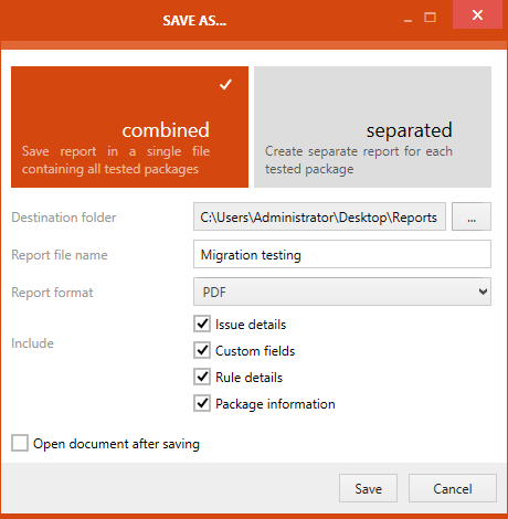
As first step in the Save as... dialog, users have to decide if the result of the test should be saved either combined or separated. If the combined option is chosen even if multiple packages have been tested, the results for all packages will be saved in just one single report file. This is also the default option. If the separated option is chosen, a report file will be created for each of the packages that were part of the test.
•Destination folder: By clicking the Browse button [...] the Select Folder dialog will be opened. In the dialog browse to the folder in which the report should be stored and select the target folder.
•Report file name: This is where the name of the report is defined.
•Report format: The report format can be chosen by using the dropdown menu.
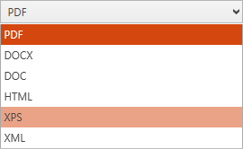
The available formats are .pdf, .docx, .doc, .html, .xps, and .xml. Choose the format in which the report should be generated
•Include: This option offers two checkboxes. The Issue details checkbox and the Custom fields checkbox. If the Issue details checkbox is checked, details on the issues will be added to the report. If the Custom fields checkbox is checked, the custom fields will be part of the report. Finally, if the Package information is checked an extra information about each tested package is printed in the header.
|
Note: When exporting reports for hundreds of packages, consider disabling the Package information option. This way, the report will be more compact and well suited for printing. |
The Open document after saving checkbox is only available if the combined option has been chosen. If the checkbox is checked, the file will be opened after it has been saved.
After everything has been defined, the report can be saved by clicking on the Save button.
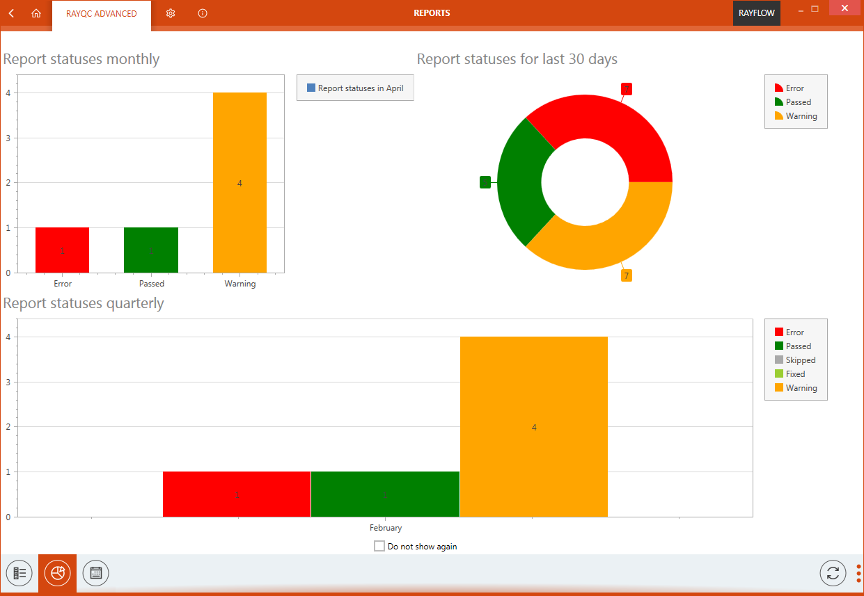
Diagrams

Clicking on this button will open the dashboard of the report section. This Dashboard offers a monthly and a quarterly overview of the status of the reports that have been made.
Details

Clicking on this button will open the details view of the report section. This view shows all library packages and their respective most recent test results..
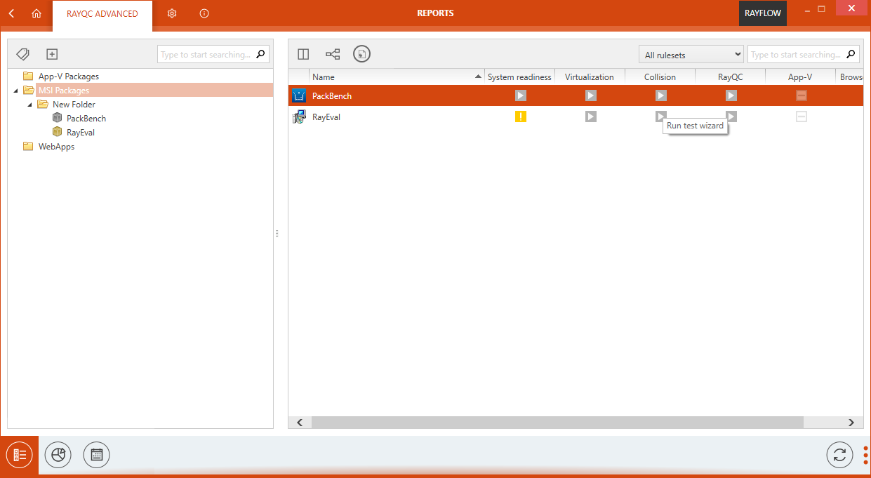
Icons represent statuses of most recent test. If a gray icon is shown, the test has not been performed on that package yet. Color statuses represent the result of the recent check.
Pressing the status button:
•for not executed tests: starts the Test Wizard.
•for already executed tests: opens the detailed report view.