The Checklist Editor is the RayQC interface for the manipulation of checklist structures and settings. To display a checklist template within the Editor environment:
•Use the open checklist tile from the Dashboard on the Home screen.
•Click on one of the template items from the Recent list on the Home screen.
•Use the Open view from the FILE menu and select the template file type.
•Hit Control + Shift + O to browse the Windows system for a template file.
![]() Either way, the selected file (checklist or project) is opened within the Checklist Viewer. To switch to the Editor interface, use the EDIT button, available from the swipe bar at the bottom of the application window area.
Either way, the selected file (checklist or project) is opened within the Checklist Viewer. To switch to the Editor interface, use the EDIT button, available from the swipe bar at the bottom of the application window area.
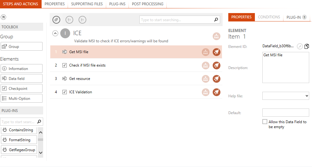
The screenshot below shows one of the RayQC checklist template examples ready for manipulation within the Checklist Editor interface:

The application window is separated into different areas with specialized functionality and data as required for optimal user interaction support. Please refer to the Working with RayQC section for details regarding global interface objects and their usual naming in RayQC.
Main Toolbar
The menu bar has been extended with the actual view name of the editor on the left-hand side. It also provides direct access to the FILE menu, with options to trigger standard procedures such as saving the current checklist or creating a new one.
Toolbar
Collapse / Uncollapse All
Toggle all checklist groups between collapsed / expanded state.
Increase / Decrease Indent
Increases / decreases indentation level of the current selection. the buttons are grayed out if the action is invalid in the context of the currently selected item.
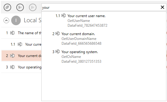
Searchbox
Start typing to perform a global search in the current checklist. When an item in the drop-down is pressed, the checklist editor jumps to that element.

Content Area
Checklist Title
![]() The title of the currently opened checklist may be edited by clicking the edit button next to it. A direct value editor dialog is displayed, ready to type the new title. As an alternative, the title can also be modified from the Properties tab of the checklist editor interface.
The title of the currently opened checklist may be edited by clicking the edit button next to it. A direct value editor dialog is displayed, ready to type the new title. As an alternative, the title can also be modified from the Properties tab of the checklist editor interface.
Checklist Canvas
All other properties of a checklist are available for manipulation via the tabbed views contained within the checklist canvas. Please refer to the Checklist Structures section for details regarding the different options that may be applied towards checklist design and functionality.
Swipe Bar
View This Checklist
Clicking on this button opens the Checklist Viewer, with the project representation of the currently visible checklist already loaded for testing and evaluation purposes. As a handy alternative, use the swift Shift + Tab shortcut to switch between the Viewer and Editor mode.
Show / Hide Swipe Bar Labels
As already described within the Working with RayQC section, the swipe bar comes in two display modes: Expanded and collapsed. The expanded mode displays a label for each button on the swipe bar, whilst the collapsed mode contains only the buttons without the labels. Hitting the button with the three vertical dots at the right-hand side of the swipe bar switches between the expanded and collapsed swipe bar display modes.