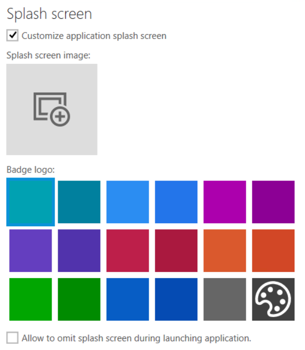
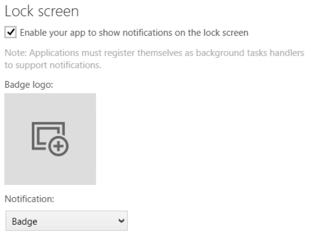
In the Splash + Lock Screen tab, there are two options that can be configured.
Splash Screen
Activate the Customize application splash screen checkbox in order to enable the options for the customization.

•Splash screen image: Select an image for the splash screen by clicking on the image icon. In the dialog that will be opened, either click on one of the Scales that will be offered in the dialog and select the picture that will used for the splash screen. Alternatively, click on the Generate button. A new dialog will be opened offering the following options:
oPath: Click on the Browse [...] button and select the image that will be used.
oScales: Scales can be deactivated by unchecking the checkbox for the specific scale. The following scales are available:
▪100%
▪125%
▪150%
▪200%
▪400%
oBackground: Configure the Background for the splash screen image by selecting it using the radio button. The following options are available:
▪Transparent
▪White
▪Black
oKeep aspect ratio: If this checkbox is activated, the aspect ratio will be kept.
•Badge logo: Select one of the prepared colors or click on the palette icon in order to define a customized color for the badge logo.
•Allow to omit splash screen during launching applications: If this checkbox is activated, the splash screen can be omitted during the launch of the application. If not, it is not possible to omit the splash screen.
Lock Screen
Activate the Enable your app to show notification on the lock screen checkbox in order to enable the options for the customization of the lock screen.
|
Note: In order to be able to support notification, applications must register themselves as background task handlers. |

•Badge logo: Select an image as badge logo by clicking on the image icon. In the dialog that will be opened, either click on one of the Scales that will be offered in the dialog and select the picture that will used for the badge logo. Alternatively, click on the Generate button. A new dialog will be opened offering the following options:
oPath: Click on the Browse [...] button and select the image that will be used.
oScales: Scales can be deactivated by unchecking the checkbox for the specific scale. The following scales are available:
▪100%
▪125%
▪150%
▪200%
▪400%
•Notification: Select the kind of notification that will be used.
oBadge: Only a badge will be used for the notification.
oBadge and tile text: A badge and a tile text will be used for the notification.